

How To Add This??
- Go to Blogger >> Layout >> Add a Gadget
- Select HTML/Java Script
- Add the Code Below
<style>
ul.flipboard{margin:0;padding:0;list-style:none;-webkit-perspective: 10000px; /* larger the value, the less pronounced the 3D effect */-moz-perspective: 10000px;-o-perspective: 10000px;perspective: 10000px;}
ul.flipboard li{display: inline-block;width: 80px; /* dimensions of buttons. Do not add padding/margins inside this rule */height: 80px;margin-right: 10px; /* spacing between buttons */background: white;font: bold 36px Arial; /* font size */text-transform: uppercase;text-align: center;cursor: pointer;}
ul.flipboard li a{display:block;width: 100%;height: 100%;color: black;text-decoration: none;outline: none;-webkit-transition:all 300ms ease-out 0.1s; /* CSS3 transition. Last value is pause before transition play */-moz-transition:all 300ms ease-out 0.1s;-o-transition:all 300ms ease-out 0.1s;transition:all 300ms ease-out 0.1s;}
ul.flipboard li a span{-moz-box-sizing: border-box;-webkit-box-sizing: border-box;box-sizing: border-box;padding-top: 15px; /* Add top padding to "center" content */display:block;width: 100%;height: 100%;-webkit-transition:all 300ms ease-out 0.1s; /* CSS3 transition. Last value is pause before transition play */-moz-transition:all 300ms ease-out 0.1s;-o-transition:all 300ms ease-out 0.1s;transition:all 300ms ease-out 0.1s;}
ul.flipboard li a img{border-width: 0;}
ul.flipboard li:hover a{-moz-transform: rotateY(180deg); /* flip horizontally 180deg*/-webkit-transform: rotateY(180deg);transform: rotateY(180deg);background: #cef1ff; /* background color of button onmouseover */-webkit-border-radius:7px;-moz-border-radius:7px;border-radius:7px;-webkit-box-shadow:0 0 5px #eee inset;-moz-box-shadow:0 0 5px #eee inset;box-shadow:0 0 5px #eee inset;}
ul.flipboard li:hover a span{-moz-transform: rotateY(180deg); /* flip horizontally 180deg*/-webkit-transform: rotateY(180deg);transform: rotateY(180deg);}
</style>
Regards
dynamicdrive

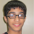 Shiraz Shakeel is a young boy who is founder and the owner of Cloudspedia. He is 13 years old and living in Pakistan, K.P.K, Peshawar. Now a days, He is studying in 7th grade and running his site.....


Avesome Post
ReplyDeletehttp://www.helpnewbloggers.me/